

With Project Domani, The National Gallery in London faces its largest and most significant transformation in the 200 years since it was founded. The stunning Kengo Kuma and Associates designed wing, as well as the expansion of the gallery’s collections to include 20th and 21st century art, will add extra layers of complexity to the museum.
This architectural mix and scale is a challenge we often see working with museums. They want people to be awed by new and historical architecture, and by the art. But all of this at once can become too much. People struggle to process what is on offer. Awe turns into overwhelm.
They walk into a gorgeous building, wander around and ask – ‘Where is the art?’.
So what can museums do about this?
Wayfinding harmonises the architecture, the collection and the visitor. Below, I share some core principles that museums can consider to facilitate this relationship, particularly when planning gallery extensions or transformations.
Reduce cognitive load to enhance focus and enjoyment
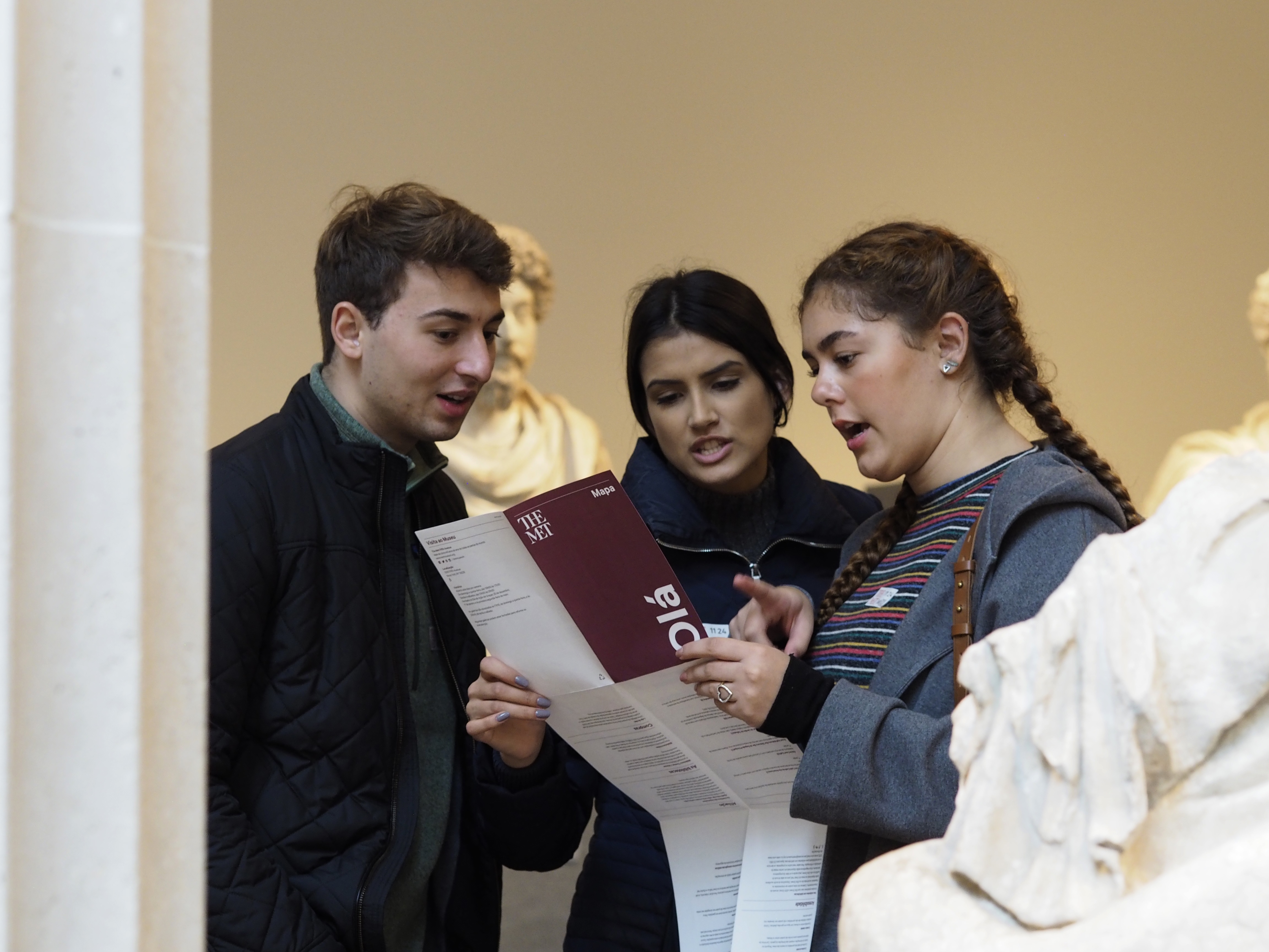
When museums expand or transform without careful consideration for inclusion into an existing gallery wayfinding system, it places a heavy strain on the visitor. Varied architectural styles are wonderful, but they impose demands on people to understand spaces and transition between them in order to find the art. This can be to the detriment of their experience as they are expending energy trying to navigate, rather than appreciate.
Structuring details in a wayfinding system around who needs what, and where, eases information overload. For many galleries, there is no longer a prescriptive route they want people to take. The goal is to facilitate different journeys and diverse groups of visitors, empowering them to explore. A careful balance is needed to make sure essential elements, such as main exhibit spaces and cafés, are not lost amongst all the exciting ‘hidden highlights’ that curators want to draw people to discover.
Creating strong audience profiles and journeys provides the foundation for a flexible wayfinding framework that adapts to different visitors, as well as extensions or transformations of the museum.
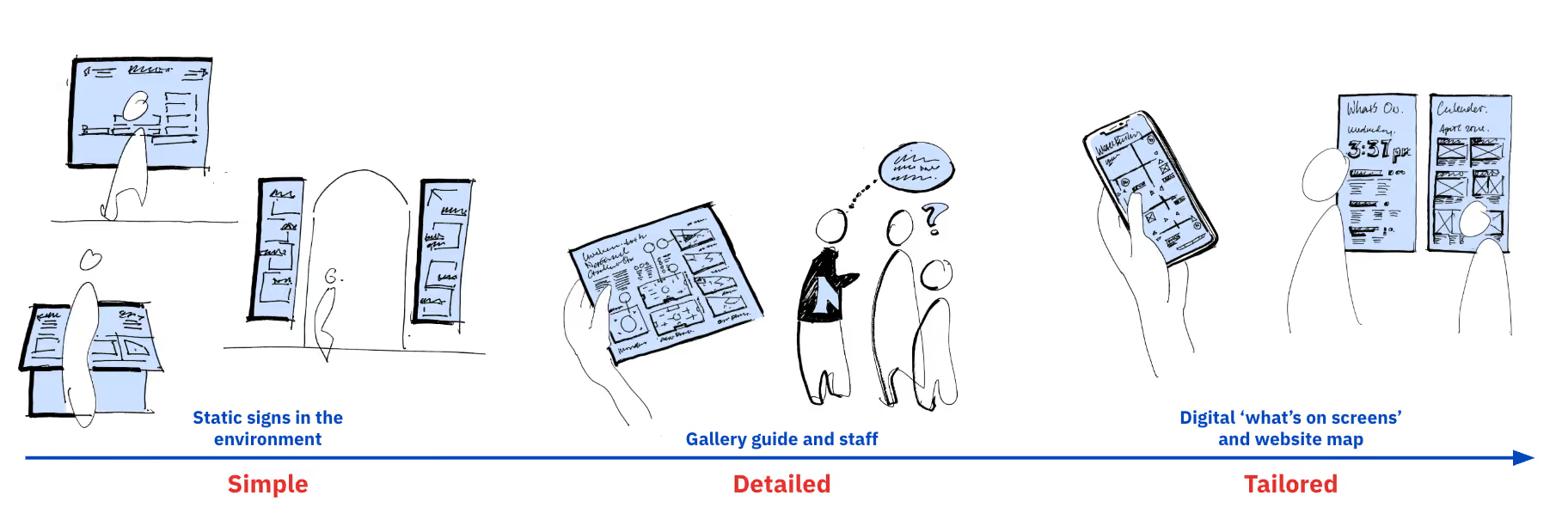
For the National Gallery of Art in Washington DC we created three approaches to information – simple, detailed and tailored. This organises both navigation and gallery information and ensures the museum’s six audience profiles are all catered to. A visitor who is there to browse is supported by signs and information in the environment, with map and diagram overviews of the buildings, directions to key destinations, as well as names of gallery spaces.
Detailed information about gallery locations and ‘must-see’ highlights are shown, level by level, in a printed map offered by museum staff for visitors who want to create self-guided routes. Tailored information, curated routes and in-depth details about artworks, events and further reading is available online for those looking to delve deep into specific elements of the Gallery’s collections.
Ease movements and transitions with visitor and space syntax analysis
Analysis of space and visitors informs instinctive wayfinding. Don’t make the space busier with signs. Make it work with human behaviour. Often small changes allow the environment to naturally guide people, like removing barriers to open up sightlines. This helps people see what options there are for onward movement. For instance, a room obscured by a display, or a staircase to another floor hidden behind a closed door.
Space syntax tools can be used to understand how connected places are to their surroundings, or whether the layout is inherently understandable to people. This is particularly helpful when buildings are in planning or construction phases, as it can be done using architectural plans. Wayfinding approaches can therefore be assessed and integrated before buildings are open to the public.
.jpeg)
There are many other techniques used to understand human behaviour in space.
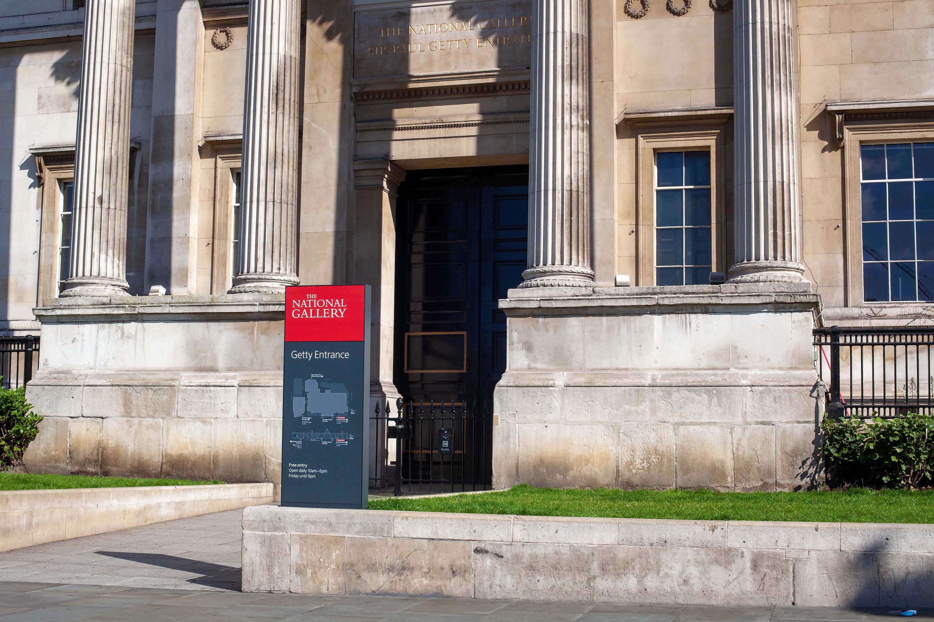
People flow modelling software was used for our project with The Metropolitan Museum of Art to analyse and design new layouts, with changes identified to reduce crowding. At The National Gallery in London, visitor movements and clusters were tracked using anonymised wifi data. User flow counting, observational studies and visitor interviews then created a detailed picture of how people used the spaces. This allowed for pinch-points and less-visited areas to be identified and the wayfinding system was designed to rebalance the flow.
Design that leaves the ego to the artists
Brand identity is critical for many museums. Bold, vibrant colours and funky typefaces are often popular in modern museum branding. Our role is to incorporate this carefully across a system so it boosts recognition and character without dominating or looking out of place. We assess for legibility and select or adapt colours or typefaces for use strategically within wayfinding.
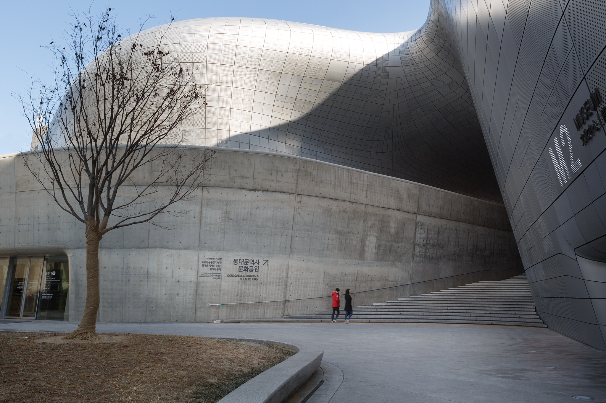
It’s not just graphic design that needs restraint. Product and industrial design is also important, especially when working with historical and listed buildings. Fixings for signage must avoid damaging the fabric of the structure.
When building wings and extensions have been constructed in different architectural styles over decades, or even centuries, the materials used can vary dramatically. Building conservation requirements can limit, or entirely prohibit, fixings to certain surfaces or finishes, such as protected stonework. This impacts the ability for new wayfinding elements to be installed.
Fixing methods for wall-attached signs often have to be adapted in order for them to meet building requirements, without compromising safety or overall aesthetic. On a recent project, sign fixings for wall mounted signs were permitted in a particular gallery space, but only within existing mortar joint lines of stonewalls. Timber surfaces present similar challenges, both within historic and contemporary buildings.
The same sign type in a system might require a bespoke product to fix it in place depending on its location. Freestanding signs avoid the need to touch the fabric of the building. They can be portable, cost-effective and designed to work across varied interior or exterior environments. Other solutions to install signs in sensitive environments include using existing holes, modifying existing sign structures and specialist high-bond signage tapes. When working on new build projects, we’d advocate for coordinating wayfinding with other disciplines, like architects, interior and landscape designers, as early as possible. This leads to better, more harmonious results.
Support barrier-free access to make everyone welcome
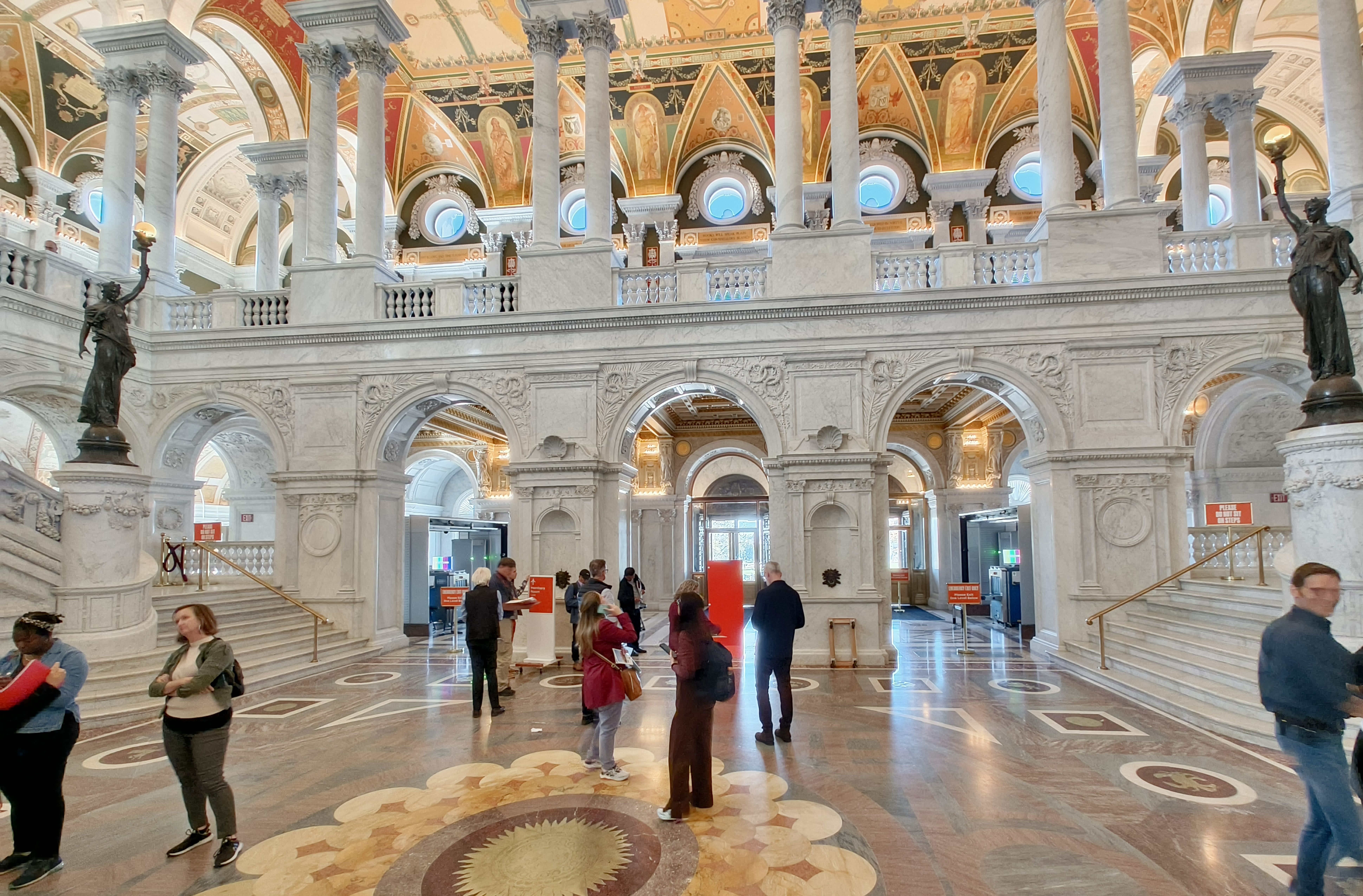
Coming back to the idea of awe. What might make one person stop in wonder and joy, prevents another from even stepping through the door. Those who are familiar with historical buildings or grand entrances often underestimate how imposing gallery architecture can be. For many people this just makes them feel ‘this place isn’t for me’.
Wayfinding can make spaces feel more welcoming, without detracting from beauty and wonder. Four key things to consider:
- Carefully positioned welcome signage and directions that easily guide people to, and through, thresholds. Bold branded banners are a popular way to show entrances are for everyone. Images of what can be seen inside entice people to enter.
- Accessible language and consistent naming used online and in all pre-arrival information. This needs to match on site wayfinding. Cross-departmental collaboration is key for setting this up and getting all teams aligned.
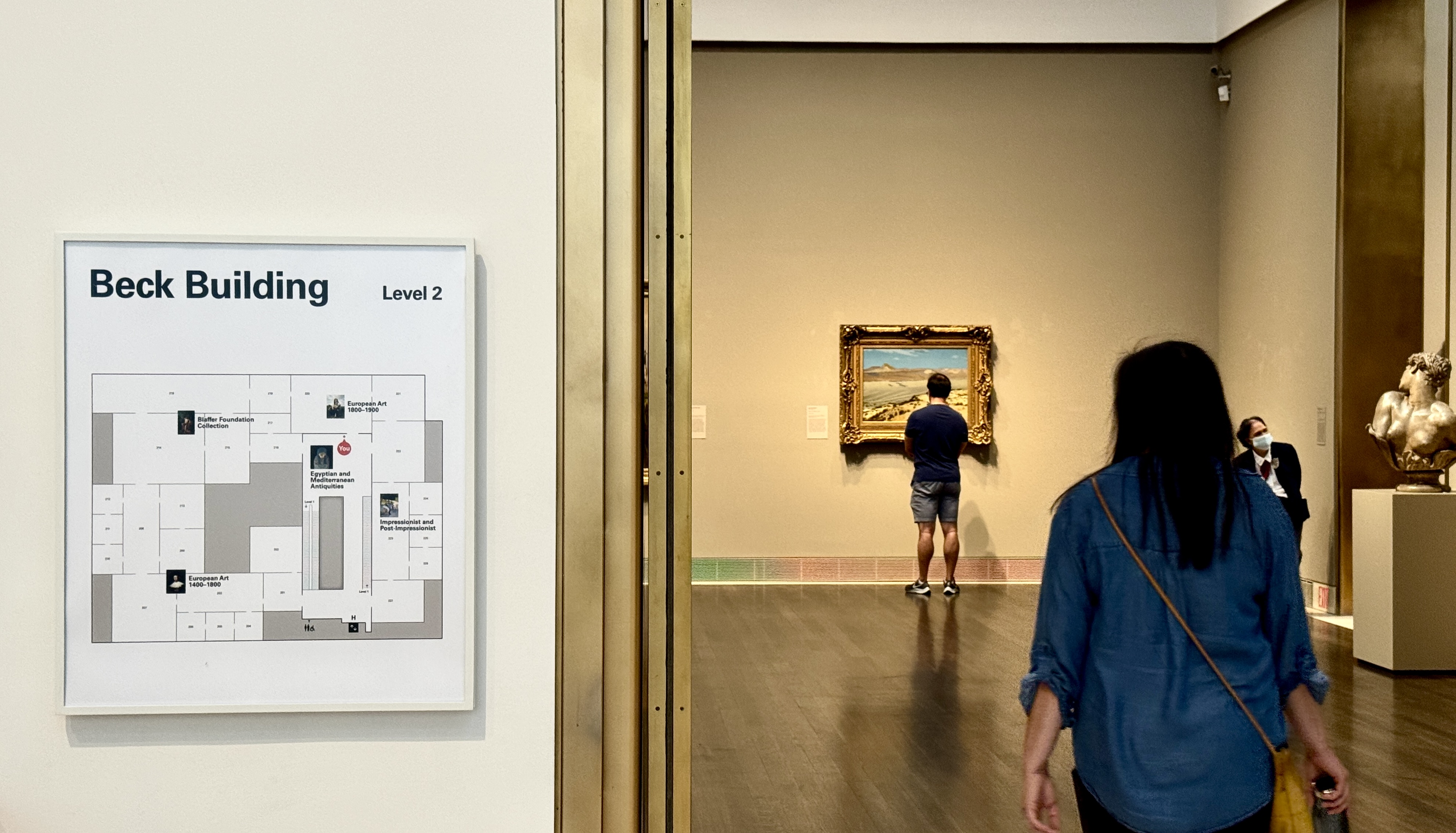
- Having core information, in a simple to understand format upfront. These should be clear visual depictions that make sense of architectural complexities, like multilevels, underground connections or floorplans with curious layouts and unusual shapes. Large maps or building diagrams placed so they are visible when someone enters work well. This sets people up to feel confident and excited moving through the museum, boosting engagement with the collections and the overall experience.
- Using icons to show accessible entrances and lifts, as well as indicating steps or steep inclines. This helps people feel confident to explore and travel autonomously.
Conclusion
Strategic wayfinding and design lets architects do what they do best – pushing the boundaries of creativity and design. It sits back where needed to let the art and architecture shine, but is designed to be prominent enough for people to find the information they need, in the right format, at the right time.
This advice follows for any museum space, whether that is science, history, technology, etc… Whatever inspires and fulfils you, we want people to direct their energy to that, not wandering around asking – Where is the art?


